Clarify Direction
We create clarity by validating assumptions and defining what success means for your product.





Clarify Direction
We create clarity by validating assumptions and defining what success means for your product.
Build Product
We design and build your product with clear milestones, shared decisions, and visible progress.
Enhance & Scale It
After launch, we improve the product based on real usage, business goals, and operational needs.
Working with Vitec means one responsible partner across the entire product lifecycle. From early decisions to live operation, we focus on measurable business outcomes using cutting-edge technology.
 Clarify Direction
We clarify goals, constraints, and priorities to create a shared understanding before development starts.
 Define the Product
We translate clarity into concrete product concepts and a realistic delivery plan.
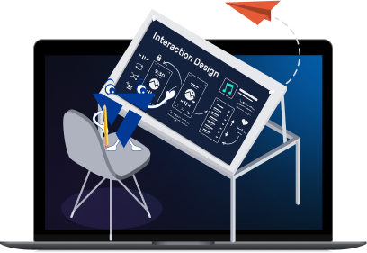 Design the Product
We design user experiences that support adoption, usability, and long term maintainability.
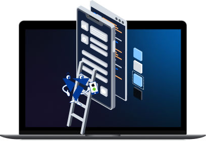 Build the Product
We build reliable, scalable software with clear ownership and predictable delivery.
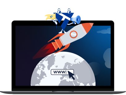 Launch & Operate
We support launch, stabilization, and transition into live operation.
 Improve & Scale It
We improve and scale the product based on real usage, business goals, and data.
From strategy to live operation, we cover the full product lifecycle.
We help you define priorities, reduce risk, and make the right product decisions before development starts.

We craft visually compelling designs and brand identities that resonate with your audience, ensuring users understand quickly and teams can maintain long term.

Successful products we designed, built, and improved with our partners.
The UX work significantly improved user guidance and visual consistency across our ERP. Vitec demonstrated strong UX competence, reliability, and a clear understanding of our requirements from the first iteration onward.
They identified with our product as if it were their own business and made decisions with long-term impact in mind. That level of responsibility is rare and made a real difference for us.
We digitized the #1 children's wrestling league in the US, transforming how events are managed for employees and customers alike. By streamlining athlete management, event coordination, and registration processes, we significantly reduced staff workload.
At the same time, our solutions increased customer engagement and loyalty by 40%, providing a seamless experience for tracking results and registering for future events.
The collaboration resulted in a professional, customer-centric e-shop tailored to our brand UNICO-Swiss. Deliverables were on time, and the team stayed aligned with our expectations throughout development. The result strengthened the brand's online presence and user experience.