Step 1
Requirement Analysis
We joined an established ERP product with years of accumulated functionality and took responsibility for its complete UI UX modernization.
Established companies with their product that has been continuously developed without a design strategy need UI/UX modernization to improve usability, acceptance, and internal efficiency.
 Likes
Likes
 Views
Views

We help you make the right product decisions before building.
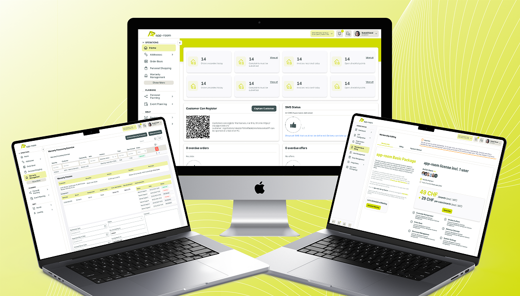
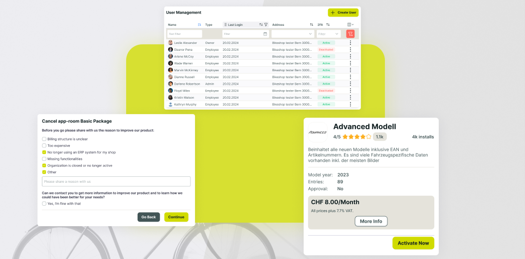
App Room is the leading ERP provider for bicycle retailers in Switzerland, supporting both small shops and large chains in managing inventory, sales, planning, and administration. As the product evolved over eight years, the interface no longer reflected modern expectations or the company's new brand identity.
The goal was to redesign the ERP to reflect current design standards, incorporate user feedback, and create a maintainable design foundation without losing any functional depth.
We redesigned the entire ERP experience by introducing a clear information architecture and a scalable design system. All existing workflows were restructured and visually modernized while preserving their business logic.
The new design improves orientation, reduces cognitive load, and enables both new and experienced users to work more efficiently.
A unified system now supports future growth and feature expansion without design fragmentation.
Step 1
Requirement Analysis
Step 2
UI Design System
Step 3
Design Transformation
Step 4
Prototyping and Validation
Step 5
Ongoing Iteration
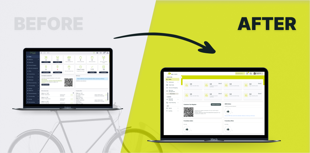
The existing ERP had grown over many years, resulting in functions being mixed across different areas, misplaced in navigation, or difficult to understand for new users. This made onboarding and product evaluation unnecessarily complex.
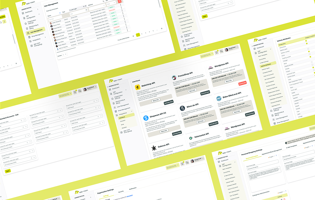
Our first major step was to completely rethink the information architecture. We introduced clearly defined main areas that separate core ERP functionality from administrative tasks. These areas are visually and structurally distinct, allowing users to immediately understand where they are and what type of actions are available.
Global actions such as component switching, notifications, and language settings were positioned consistently and remain accessible at all times.
This restructuring significantly reduced cognitive load and made the system easier to explore, especially for first time users.
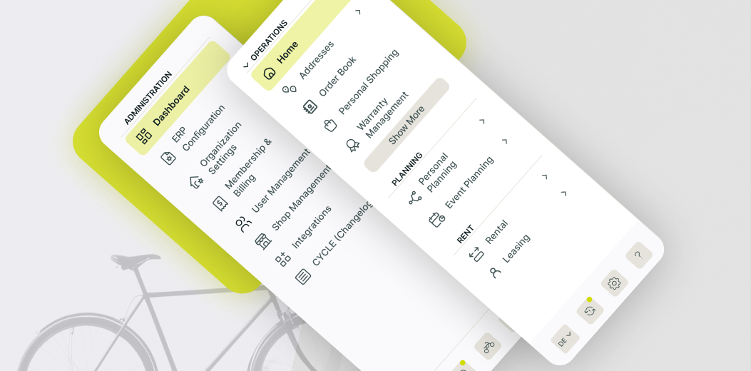
To support fast and confident navigation through hundreds of functions, we designed a modern left navigation tailored to daily ERP usage.
The navigation is expandable and structured into clearly labeled, collapsible categories that reflect real user workflows.
Frequently used functions are displayed directly, while less common actions are placed behind a contextual show more logic to avoid clutter. Visual hierarchy, spacing, and hover behavior were carefully designed to guide the eye without overwhelming the user.
This navigation system allows users to reach their target function quickly while maintaining an overview of the entire system, even as new features are added in the future.
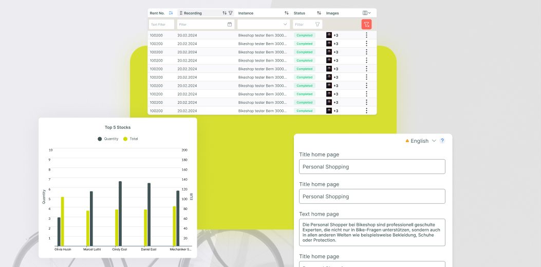
More than twenty core ERP functions across operations, planning, and rental management were redesigned and in many cases restructured.
These functions include stock levels, product management, rental handling, and employee planning across multiple locations.
Each feature was analyzed individually to understand its purpose, dependencies, and usage frequency. Based on this, we redesigned screens to surface the most important information first and move secondary details into contextual views.
Reusable components such as tables, tabs, alerts, cards, and contextual menus were designed as part of the system, ensuring consistency across all ERP areas while allowing flexibility for function specific needs.
Administrative functions were previously spread across different areas, making global configuration difficult and error prone.
We separated administration clearly from operational workflows and consolidated all related features into a dedicated area.
This includes billing, global settings, user and role management, license handling, add ons, and integrations. Information is displayed progressively, ensuring that administrators see the right level of detail at the right time.
The goal was to make administration powerful yet easy to understand, enabling companies to manage their ERP confidently without requiring constant support or training.
Understanding and redesigning a highly complex ERP built over many years without original design documentation. Deep functional dependencies required careful analysis to avoid breaking workflows.
True UX improvement in enterprise systems requires understanding not only interfaces but also business logic and industry context. Investing time in domain knowledge pays off in usability and trust.
These learnings help us modernize legacy systems responsibly, reducing risk while unlocking measurable business value.

When modernizing complex products, invest first in information architecture and design systems before touching visuals. Structure enables sustainable change.
Designing a full scale ERP was a unique challenge for our team.
Unlike consumer apps, ERP systems require extreme clarity, consistency, and respect for existing workflows. By transferring best practices from leading SaaS products and combining them with deep industry understanding, we created a modern yet familiar experience.
This project marked our entry into large scale ERP design and established a long term partnership built on trust and shared responsibility.
Explore our online portfolios to see a diverse range of our creative work. From innovative designs to impactful projects, discover how we bring ideas to life!


Experience our mobile app firsthand! Download it from the Play Store and explore its features.

Experience our mobile app firsthand! Download it from the Play Store and explore its features.

Check out the live website that complements our app and see the design and functionality in action.
Experience our mobile app firsthand! Download it from the Play Store and explore its features.
Experience our mobile app firsthand! Download it from the Play Store and explore its features.
Check out the live website that complements our app and see the design and functionality in action.

The UX work significantly improved user guidance and visual consistency across our ERP. Vitec demonstrated strong UX competence, reliability, and a clear understanding of our requirements from the first iteration onward.
Every successful project leaves behind measurable results and a clear path forward.
The references below show how we work, what we deliver, and the outcomes our partners achieve with us.
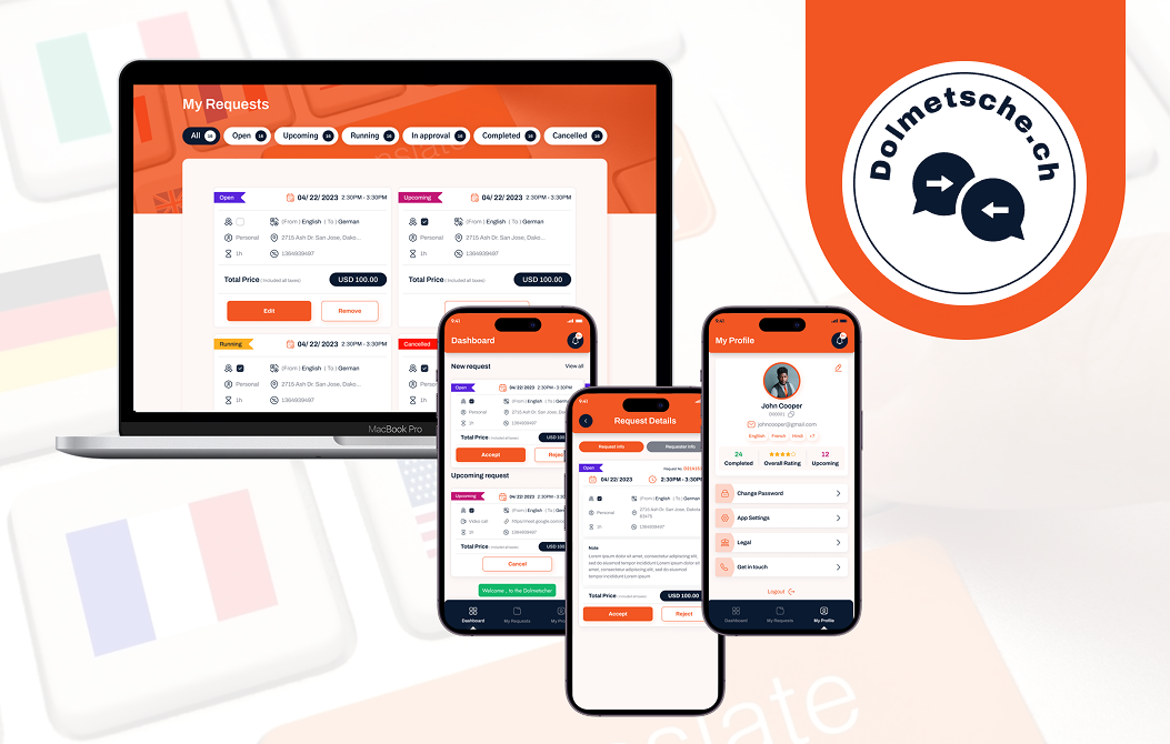
A Full-Stack Translation Service IT Solution
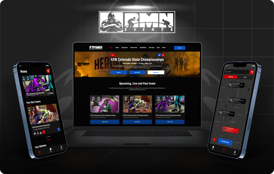
Digitizing the USA’s #1 Kids Wrestling League
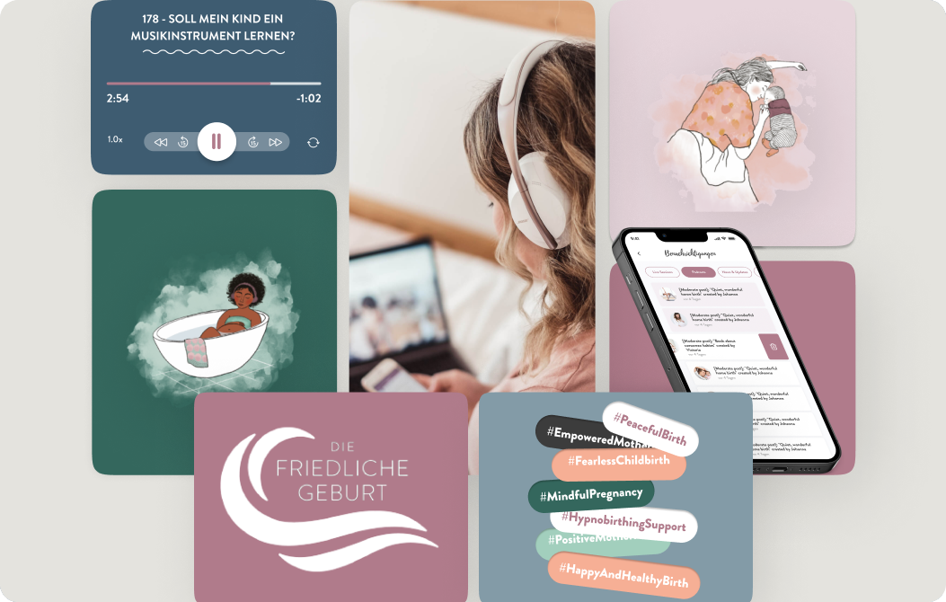
Germany's #1 Birth Preparation
