An unique UI/UX and special components that will inspire us all

The patience has paid off. This is the next blog in our series of the evolution of Vitec GmbH. You can experience here up close how more UI & UX thoughts and our vision were transformed into unique and matching elements. If you have not read the first blog, we strongly recommend you read that blog first and then come back here to read this blog.
While in the first part we focused on developing basic themes like color palette, CTA, icon sets, etc., now we will dive deeper into how we used them to translate our vision into the UI & UX and to you.Let’s go!
1. Vitec Mascot Introduction
Mascots can be a divisive choice for any organization. Though they deliver an instant personality, some companies consider them a critical visual element while others deem them optional.
Building our Vitec mascot was a fruitful exercise that enhanced our UX.
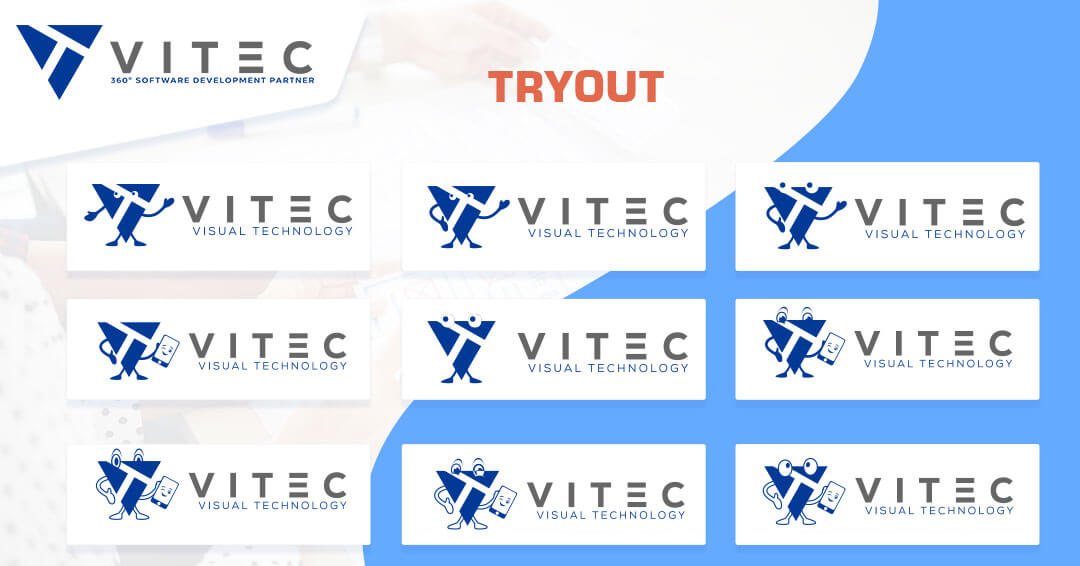
Step 1: Tryout
We started on our mascot as another point of brand identification. The decision to humanize the logo was made to make it more personable and reflecting our vision to be your 360° Software Development Partner. We did not want to position ourselves as a dry service provider. We want to go beyond and become a service partner our customers can rely on. Our mascot will guide you on our website and journey We went through multiple iterations of the mascot – details of the eyes, the height of the arms & legs, and color use.
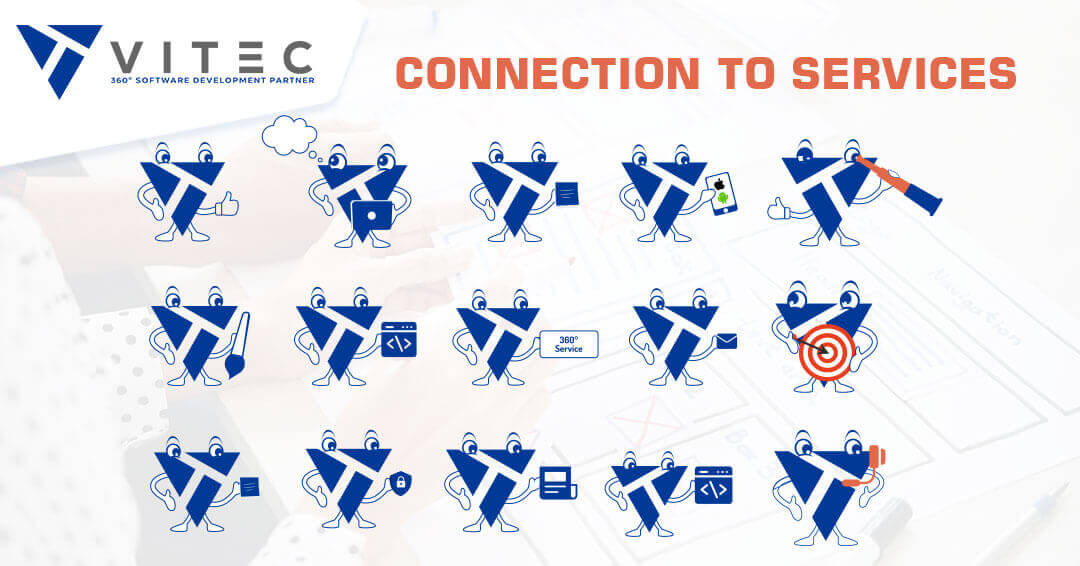
Step 2: Connection to Service
Once we had reached an agreement about the logo's visual components, it was time to ensure that it clearly represented what we did. We decided to add a mobile in the mascot's hand and include our tagline under it. So, whenever our clients thought about software development, they thought of Vitec.
Step 3: Integration
Now that the visual and functional elements of the mascot were in place, it was time to integrate it into the very fabric of our website. Our mascot was not just a part of the Home Page, but it changed depending on the service page the visitor was on. So, if we had a visual on the website development page, our mascot would be integrated into the graphics used for that custom page.

2. Objects, GIFs, And Animation Design Direction
The media is an incredibly visual and impactful part of the process. In our development journey, we ensure that all the media had a two-fold purpose.
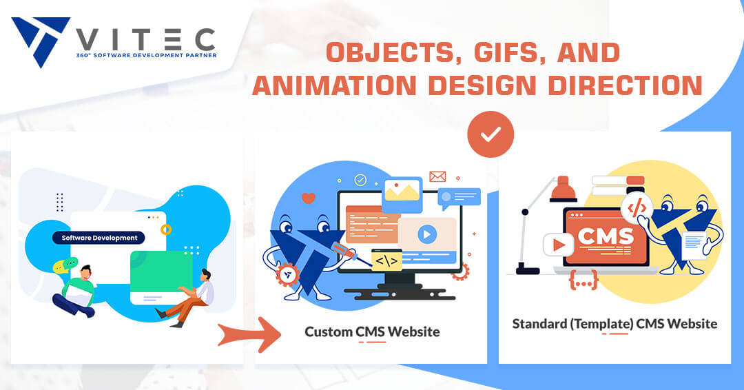
- Act as Markers
Every object that denotes a specific service is clickable to reach the landing page for the service. For instance, on the Home Page, the mobile app development GIF will show as a part of a universe of services, and when you click on it, it will take you to the mobile app development landing page that uses the same design basics.
- Unifying Elements
Every object, GIF, and animation was carefully designed and placed to give the visual cues to our partners that they are a part of a complete service experience. They clearly understand that they are not separate services, but one part of the whole. Each element makes a meaningful connection to our understanding of partnership by complementing it with our customers, the mascot.
3. Services Section
We observed a departure from our vision when it came to the services section. On the Home Page, we had separate boxes for each service. That created a disconnect between each service and sent a signal to the prospective customer that there were no synergies.
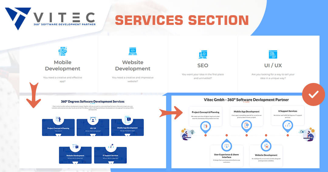
The service section on the Home Page was changed to showcase a timeline. The timeline gives an idea of how each service appears in the complete software development life cycle. This allows them to look at it as a process instead of a bunch of services clubbed together. This is further reiterated by the corporate video that explains the concept of the 360° vision. The Home Page and the corporate video also refer to the unified elements in the technology icon and the company logo.
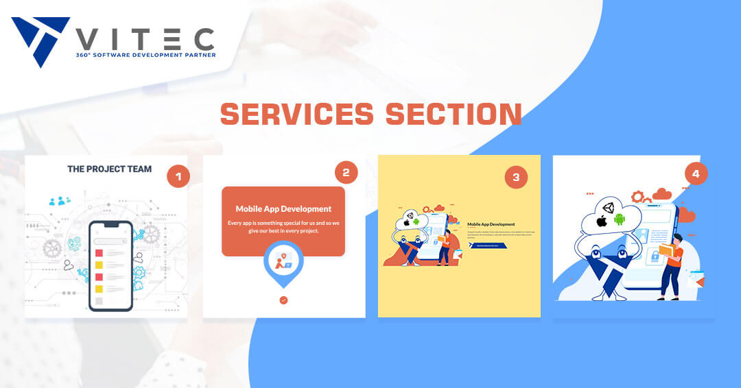
Let's take the example of the mobile app development service. The Home Page is a part of the infographic to illustrate its place in the whole software development process. It forms a part of the services shortcut under "Other Services". Again, it appears as a part of the 360° services page. Finally, its individual page has many familiar elements referring to its synergies with the rest of the service offerings.
4. Price Calculator / Contact Banner Element Update
This was a crucial element for our business. We knew that a visitor interested in our pricing is close to conversion. So, we wanted to ensure they had an unhindered experience, especially with the price calculator and the contact process.
We completely customized the pricing calculator of our website to try out rather non-traditional design elements to create a truly unique page.
We moved away from the standard subscription page or popup functionality, which is quite common these days. Instead, we opted for an interactive popup element that:
- Builds Trusts
It features the same pallet of colors with the company mascot. So, the buyer gets an interactive and familiar face to talk to. It is critical that the prospective customers have a trigger (here, it's the trust-building mascot) that generates positive emotion at the right time. This is when the "lead" is getting prepped to convert to our new partner.
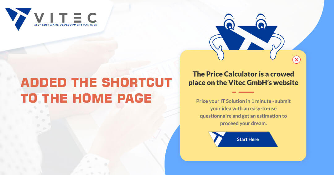
- Added The Shortcut to The Home Page
We did not want to come too strong at the visitor. So, we placed the price calculator in the middle of the Home Page using the interactive popup element. It does not push the visitor to check the prices merely suggests it.
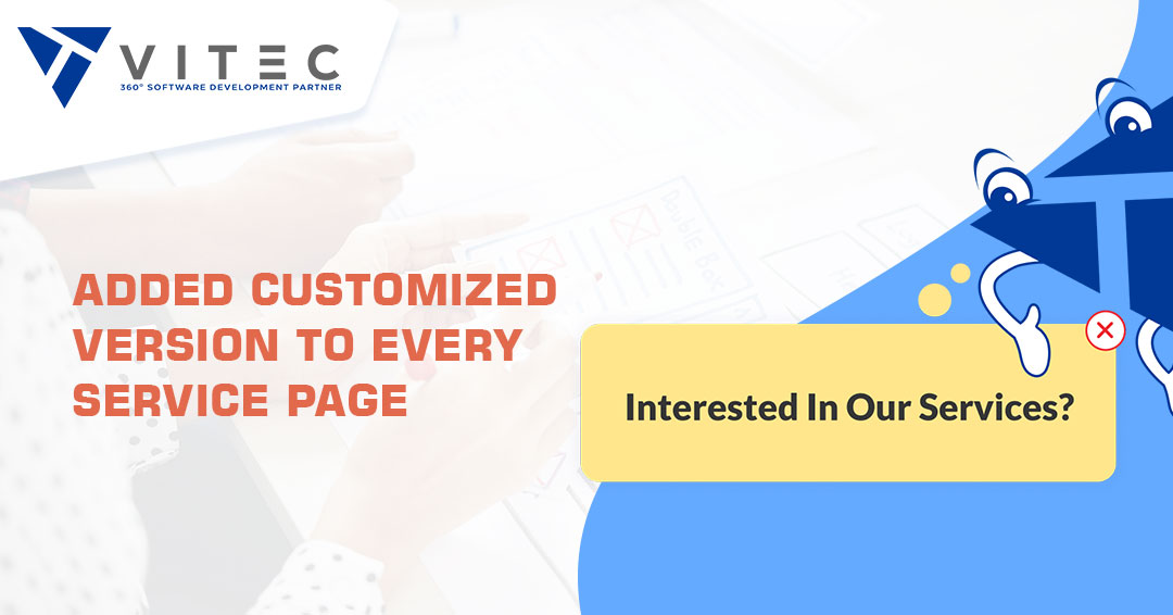
- Added Customized Version to Every Service Page
For, e.g., you are on the UI/UX page, the price calculator element will customize the message to "Interested In Our UI/UX Services?"
5. Portfolio Concept
Our portfolio page is a huge conversion booster for us. When our potential customers see the use cases - the 360° success stories of partners from their goals to inspiring results - it boosts their confidence in them. We wanted our new portfolio concept to be more straightforward, convenient, and powerful. We followed a 3-pronged approach here.
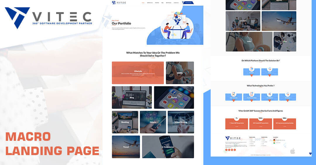
Prong 1: Macro Landing Page
We created new, nuanced, and more focused use cases underlined the 360° approach. Our landing pages highlighted the diverse nature of our partners and the purpose-oriented technologies we used. The idea was to communicate many dense pockets of information engagingly. Every element on the landing page linked back to our new brand of the 360° Software Development Partner.
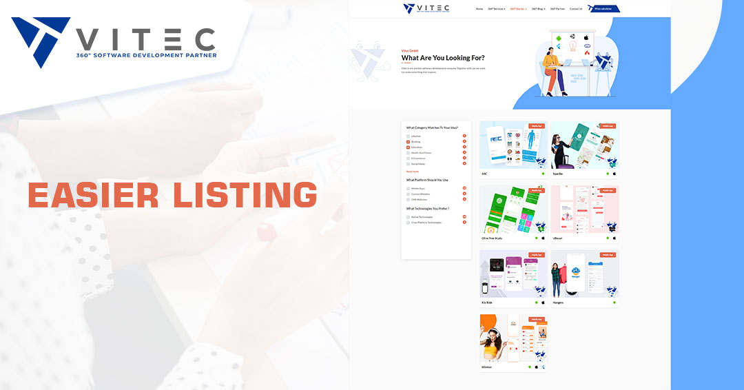
Prong 2: Easier Listing
The navigation on the page was dramatically improved by introducing filters like industry type, platform in use, and preferred technology. It significantly reduces idle browsing time and helps prospects find what they are looking for while they have the energy to read it.
We also focused on the target the visitor was looking for, rather than pure industries/technologies. To answer the question that every client has: I have this idea/target - do you have experience with it? Can we achieve the goal together?
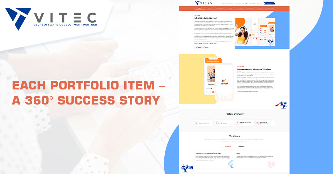
Prong 3: Each Portfolio Item – A 360° Success Story
Our biggest desire, however, was to create the 360° Success Stories behind the projects. We wanted to share the story of our partner's vision and how we turned that vision into a working IT Solution to the world. A story that inspires and shows that as a 360° Software Development Partner, we have made it our mission to not only implement a vision, but to become part of that vision. That we not only achieve it together, but transform concepts into solutions, successfully master challenges and learn from them - in a partnership with the goal of creating a unique and convincing IT Solution.
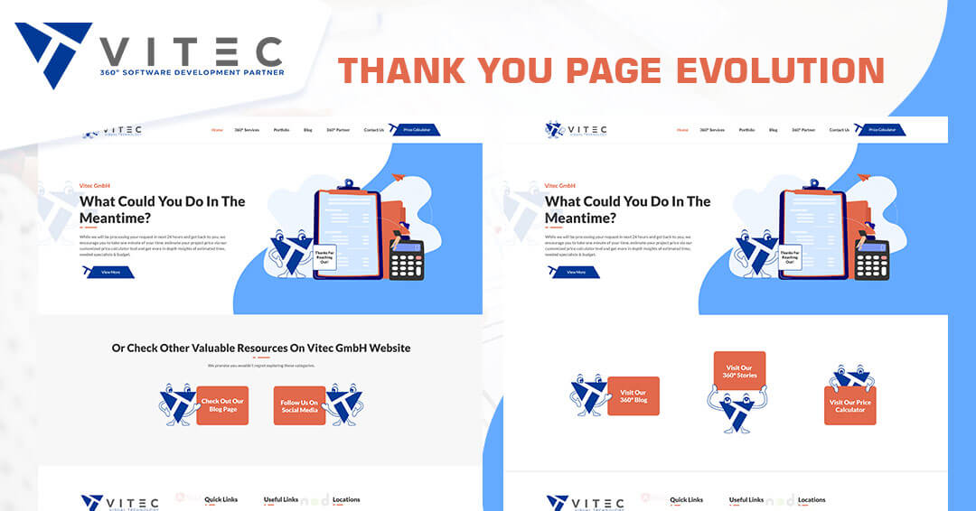
6. Thank You Page Evolution
Earlier, our website did not feature a Thank You page. After the 360° journey, we discovered that a Thank You page was pivotal. It was nothing but another point of contact to further engage our customers with our 360° Vision.
We created a Thank You page for Contact Us and for the Price Calculator. Both the pages were then personalized with our mascot. The mascot is a compact version of what Vitec GmbH stands for and stays in the mind of the visitor after they leave.
Last But Not the Least – Not Just Content, Optimized Content
We created a beautiful Vitec website, but our customers needed to find us first. Many intricate UX and UI elements help realize the vision of our business, and then it's time for SEO.
1. On-Page SEO
We optimized every single page on our website for the search engines, specifically Google. It includes optimizing title tags, web page URLs, content, and internal links. So, if a customer is looking for anyone step in the lifecycle of our 360° approach, they will find our webpage on search engine result pages (SERPs)
2. Content Management
The Google algorithm demands high-quality content if you want to see your page on the top of SERPs. We ensured that our content was informative, impactful, keyword-optimized, and constantly refreshed.
Time to Evolve!
At Vitec GmbH, we have not only built a service that supports your business but an ecosystem in which your business can be nurtured for success. Obviously, we won't leave any stone unturned in offering our visitors the best experience on our website. We tested our approach, and generated results!
Story continued – implementing the vision in real time. We’ll be glad to show you how we did it. Our developers are working hard and full time our success stories, therefore the coding part of redesign journey is yet to be written. In between, jump out to see how we maintain and enhance those 360° Stories in our last step in transformation journey story – IT Support.


Aleksandar
Aleksandar is a passionate digital marketeer with 6+ years experience in various industries. He finds the data & numbers are the way to market things, but also that words are the bridge between just a numbers and brand value, purpose and strategy brought to a user. Using the 5 'W' methodology in creating the content, he is adding 'a plus to a minus', creating simple, but informative blogs & case studies about latest trends in tech & digital indsutry.